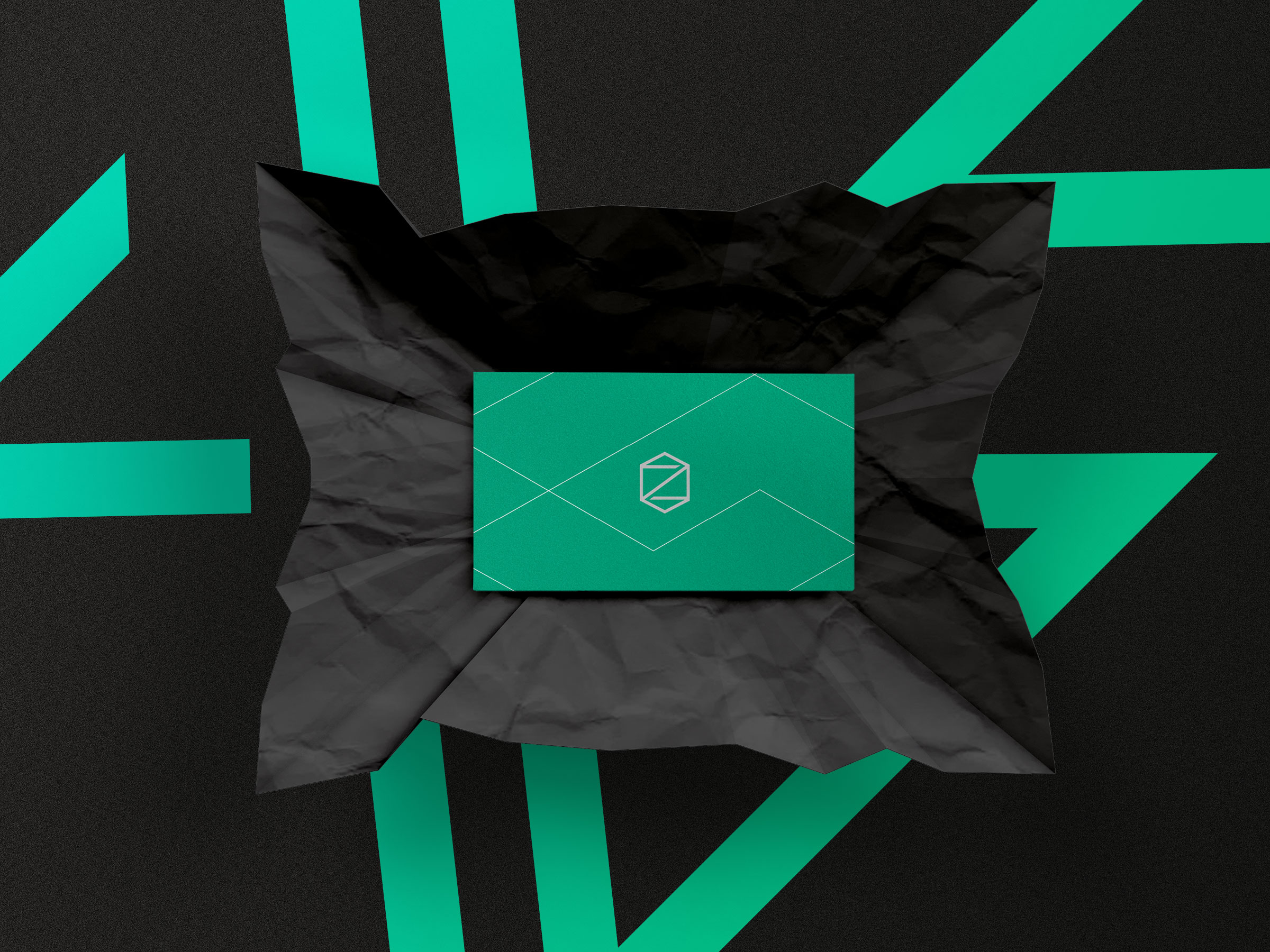
A business card I did for Zetina Construction Solutions. I haven’t shown the logo much yet but this one I’m very proud of. The logo is composed of a bolt and the letter Z to create this structured shape. I have a lot of other structural elements I’ve used in patterns of their branding.
They liked these cards so much actually already reordered business cards for all their employees recently. I thought the bright green and silver were a really interesting combination that I don’t often see.
I’m currently working on the case studies of their website. Stay tuned!


