I’ve decided to start doing some spotlight posts for some of my more recent designs. I thought it would be a great way to dive into my design process, and showcase what some of my branding packages can do for my clients. Here it goes!
Little Embers Learning Co. is an educational book series run by a husband and wife duo. They saw the need for mentally stimulating infants with exercise that is influenced by their christian faith. As I’m writing this during the current quarantine, it seems like something families need more than ever, as since March many parents have been having no access to daycare or other stimulating activities for their babies.
Brand Package III
Two Logo Options
Two Revisions
Primary and Secondary Logos
Color Palette
Font system
Brand Guide
+
Layout Design for their book
Process
I started by meeting them at a coffee shop (remember those?) to really get a feel for what they were all about. We went through my design workshops fairly quickly. I typically give all my clients all the information on these ahead of time so they have time to prepare and really think about their business.
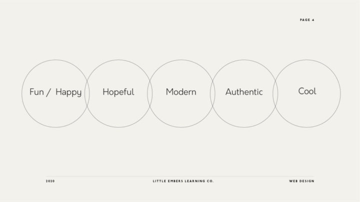
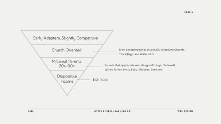
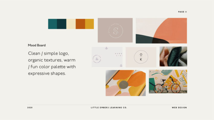
You can see the strategy below of who we were trying to reach, and where we landed on the mood board. These are me laying down the blueprints of what the goals of the design are.
Sketches
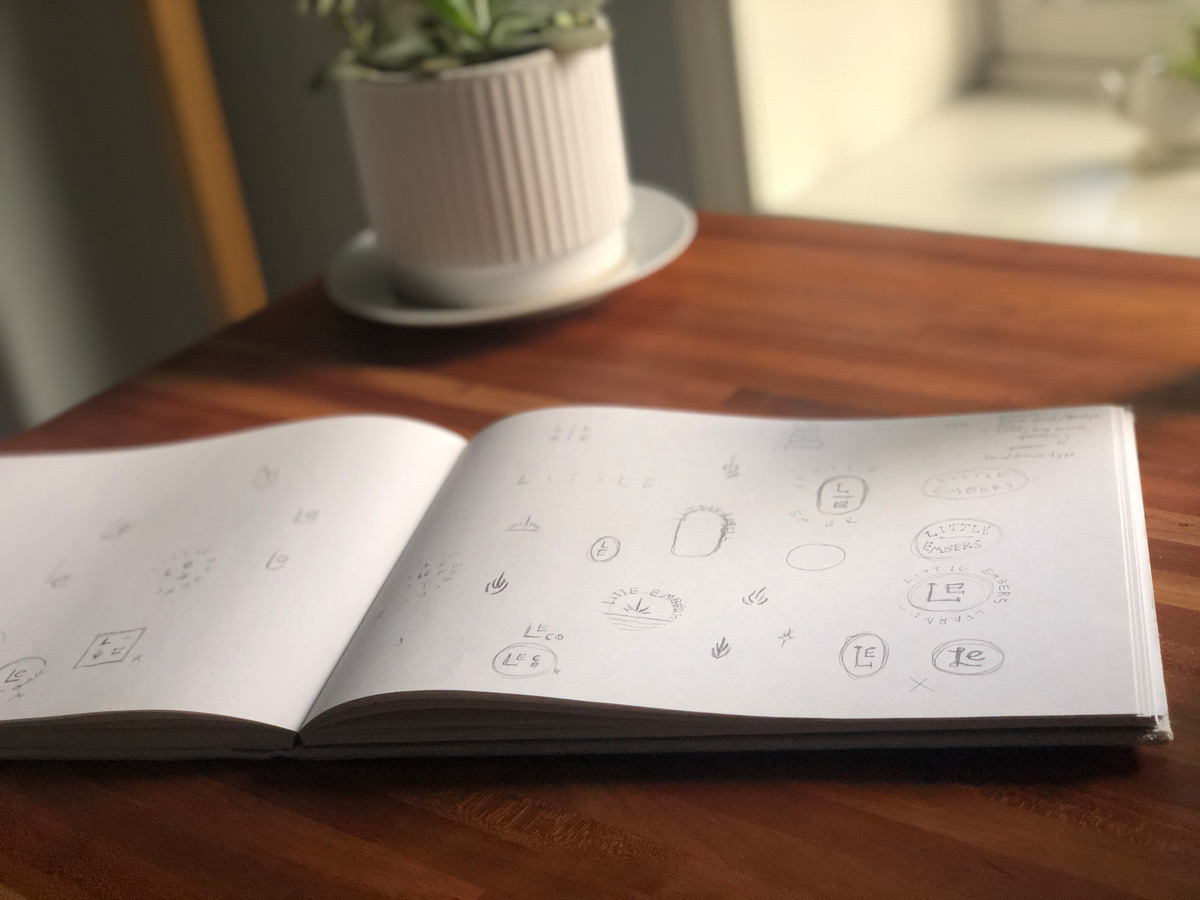
Here’s some behind the scenes sketches of my how I work. When I say two logo options…it’s usually narrowed down from dozens of logo sketches, and ten or more vector sketches. A lot goes into finding the perfect mark. I usually have a lot of fluid sketches that I star with a highlighter and bring the ones I think have more legs than others into Illustrator.
First Round
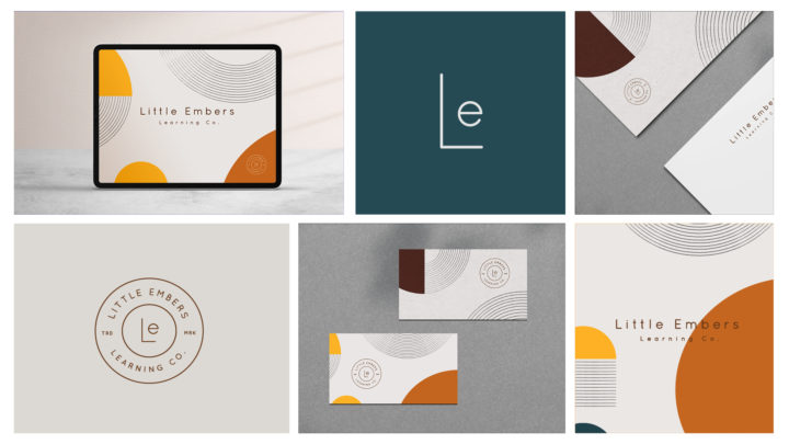
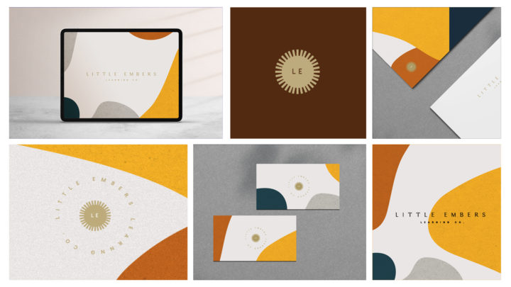
For the first Round, I’ve showcased two logos based on the above strategy. I always send over an in depth rationale for my logo options, just so the client can see inspirations and where I’m coming from.
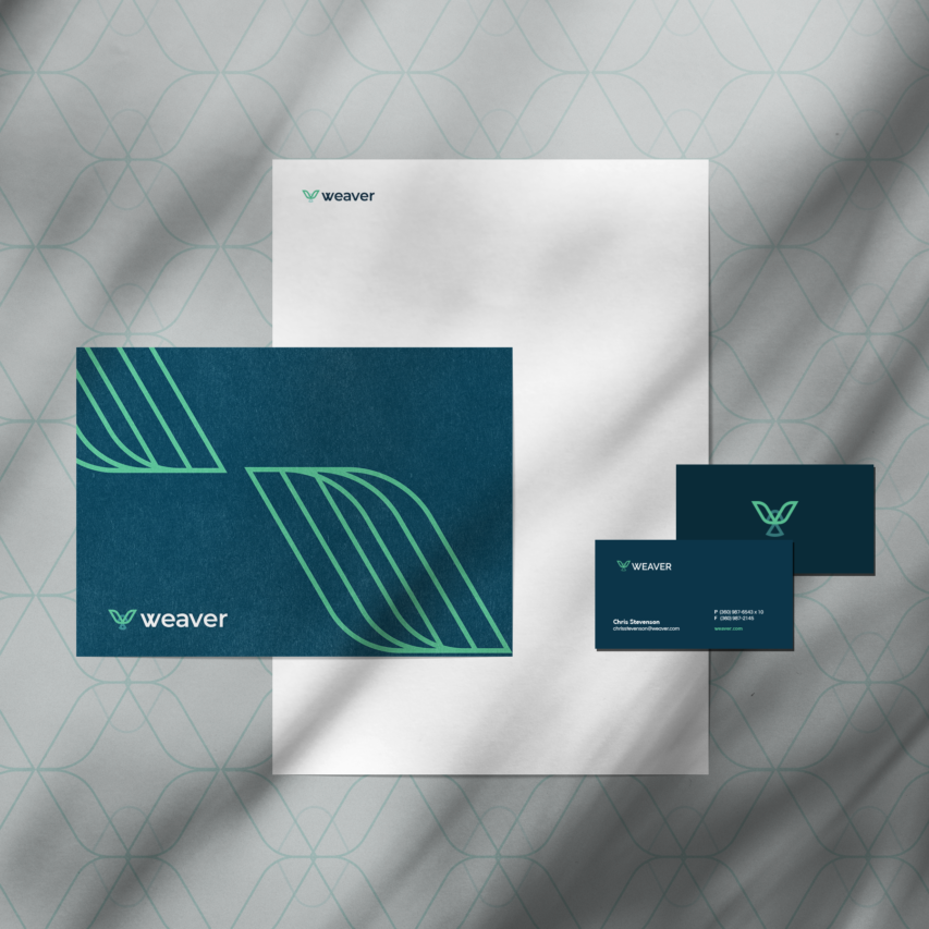
For clients that do my II and III brand packages, I always include some mock ups with the patterns, color schemes, and logos. I do this because to be quite honest, it’s hard for someone to see how their brand will work with just a logo on a white background. This way shows them how to see each option holistically.
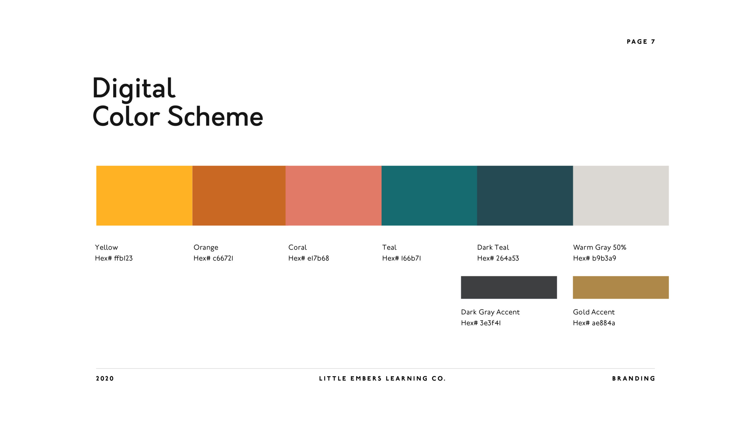
I actually really loved both of these. I even posted one on Dribbble just to show to my other designer friends. There was something off though. Tyler and Aarika really liked these, but believed something was missing. While my designs were “embers” her initial idea was of something with more fire. Something to show that this program sparks inspiration in learning. We decided to do another round of logos that were more inspired by fire. They chose to modify option 1 with a new mark, and to add a warm coral to the color scheme.
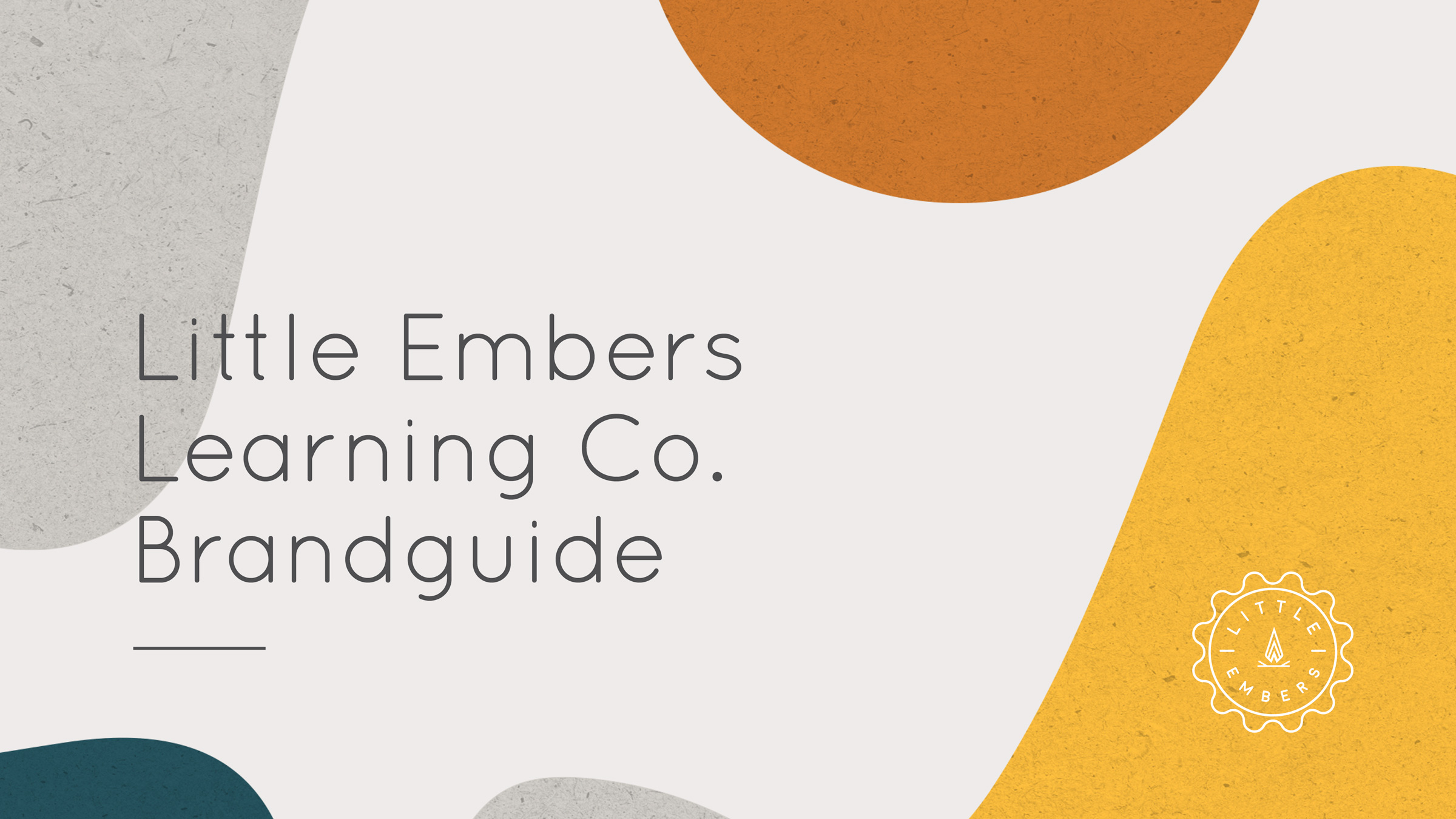
While the logo was sophisticated to appeal to the correct demographic (millennial mothers), bright organic shapes were also added to give it an inspiring look for the infants. The idea was that it was something the parents wouldn’t be embarrassed about having on their tablet (and someday as a physical book) while still looking stimulating enough for the baby.
Second Round
And then we had FIRE! I was honestly so excited when this mark was finished. I loved how simple it was, and I was able to use it on several different badge iterations. It looks great on it’s own, and in all orientations. I also paired it with an official seal inspired shape (below) to go along with education / learning.
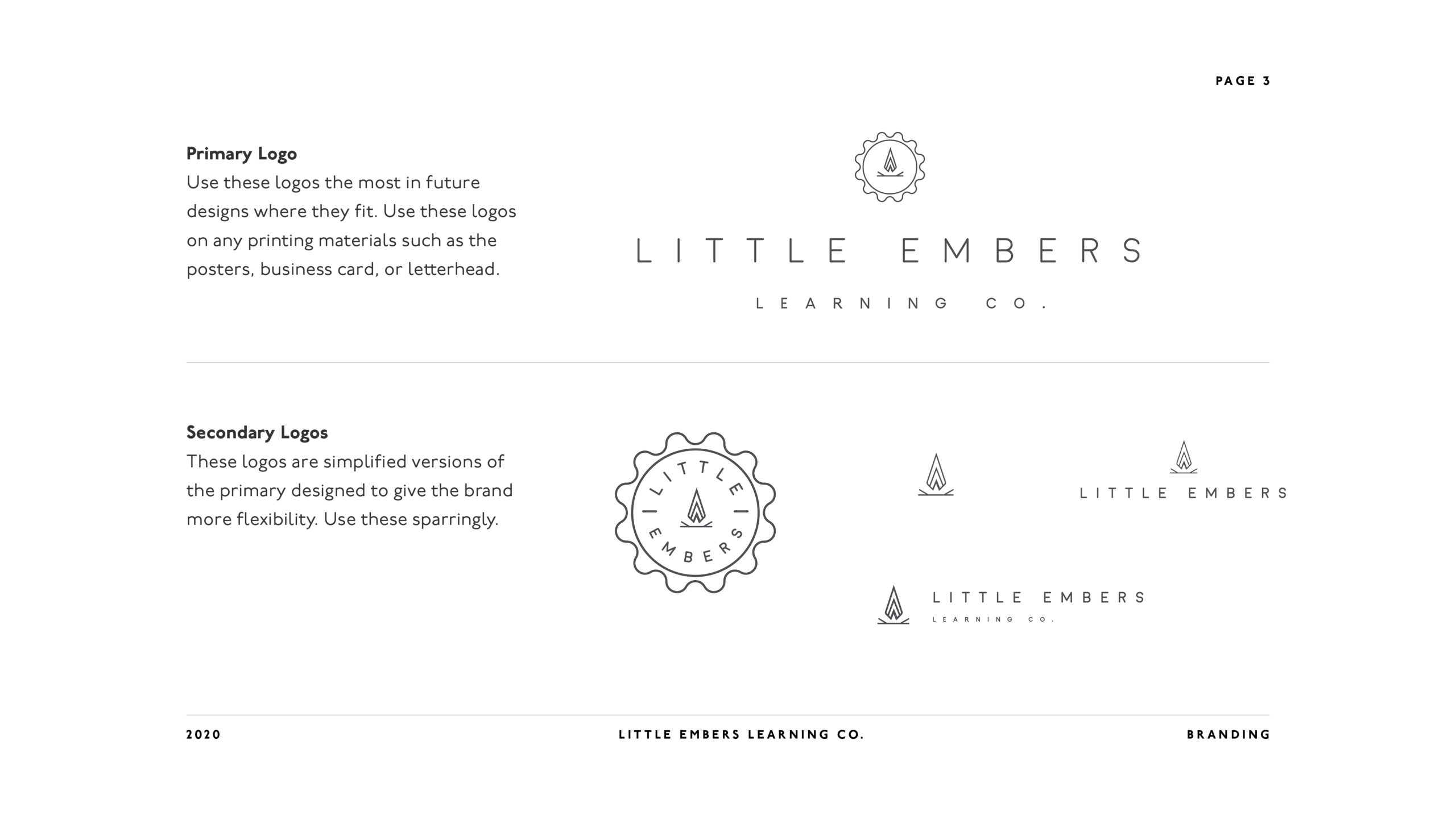
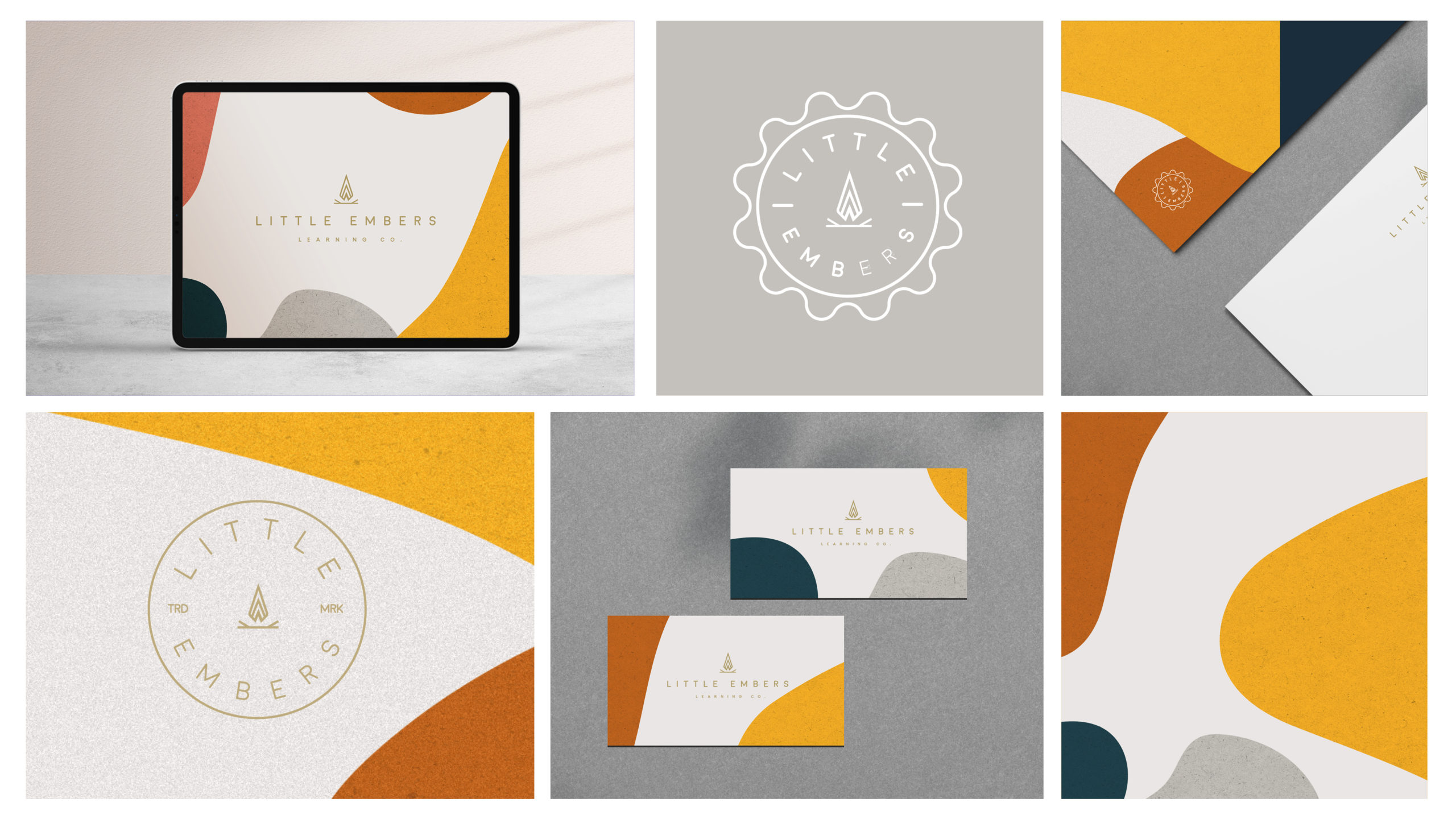
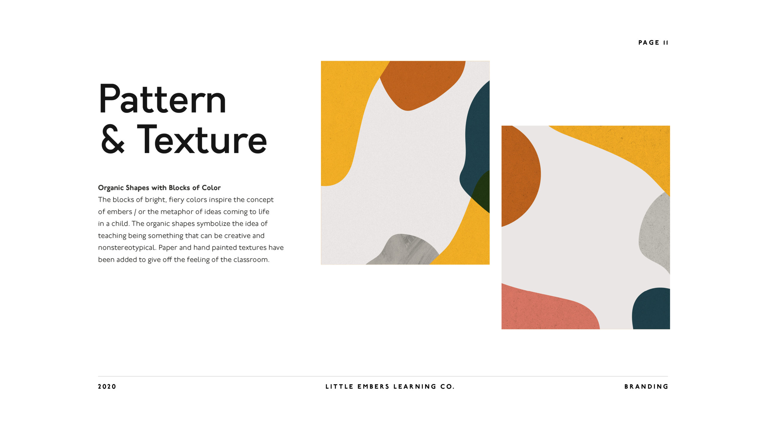
Tyler and Aarika loved their logo, and I was happy that they were so into it. It seemed like a perfect fit. The style of it with the colors and shapes was so different than what I typically do, which made me feel like I had grown as a designer.
Dribbble
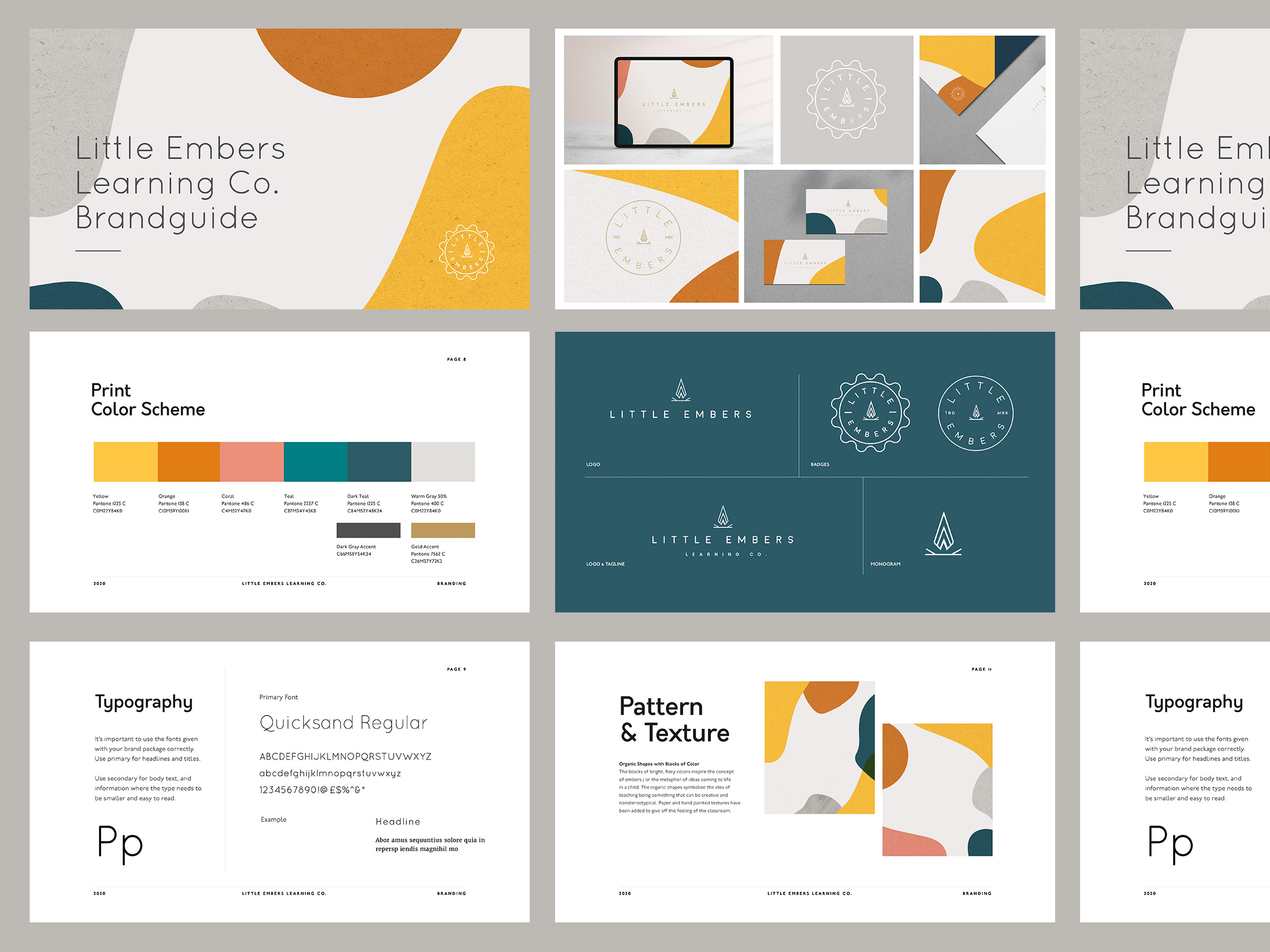
I haven’t done a post like this, but I’m glad I did. Showcasing the brand guide in this format was a huge hit on Dribbble and gained more traction than any other post I’ve ever done.

If you like how I work, feel to contact me below. I’d love to go over your ideas!

