Pepsico
Web Design & Brand Identity
Shoptology
Creative Director: Buck Choate
Designer: Camron Turner
Pepsico had launched an internal department that was used to analyze data. Shoptology had already created an approved logo, with some approved colors (the pepsi blue) and hired me to help expand on the brand.
The Brand
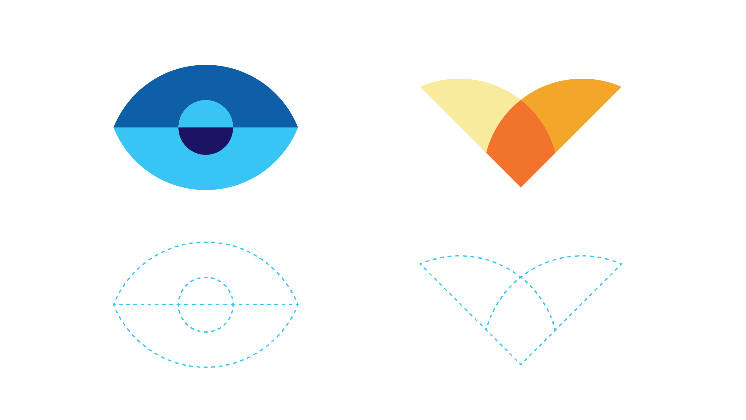
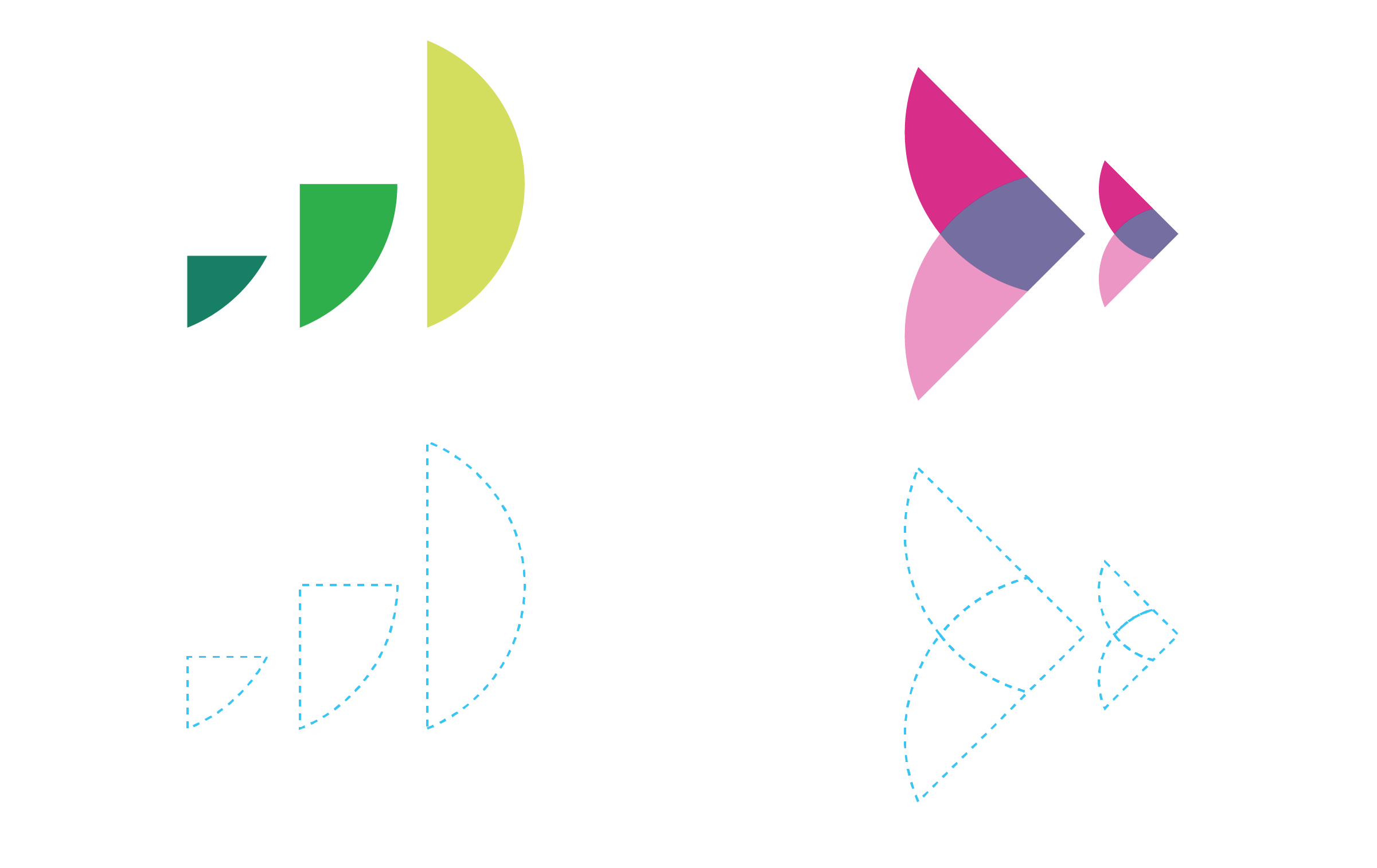
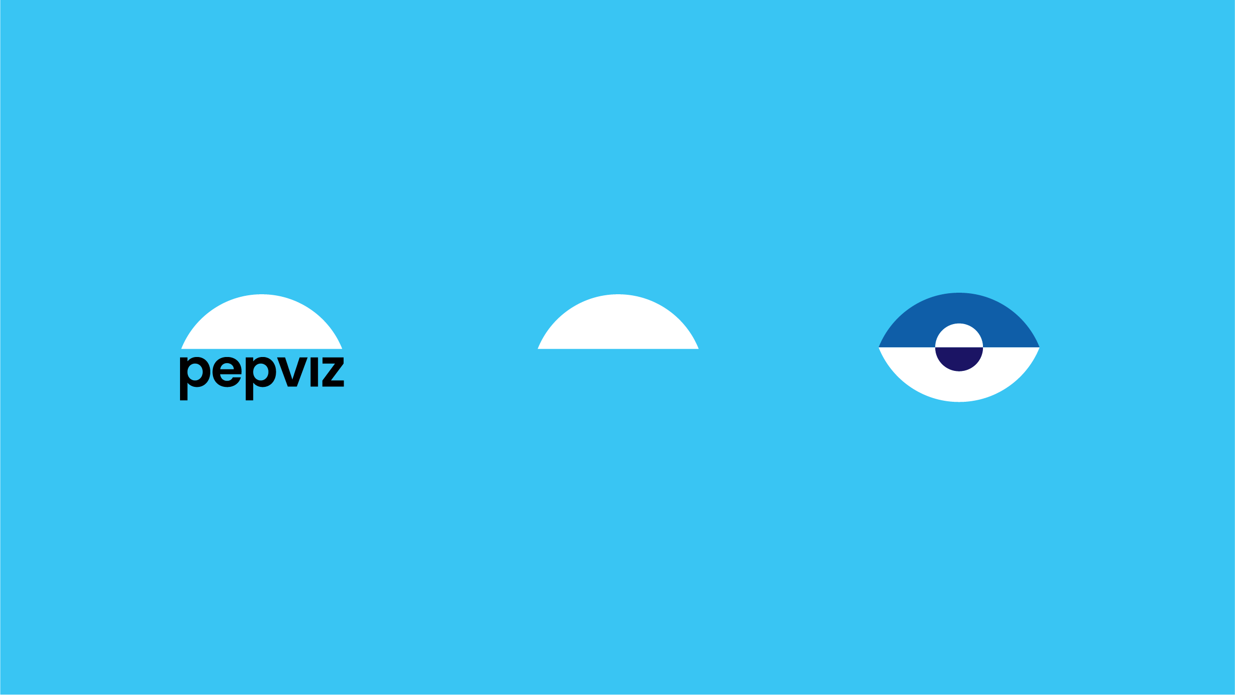
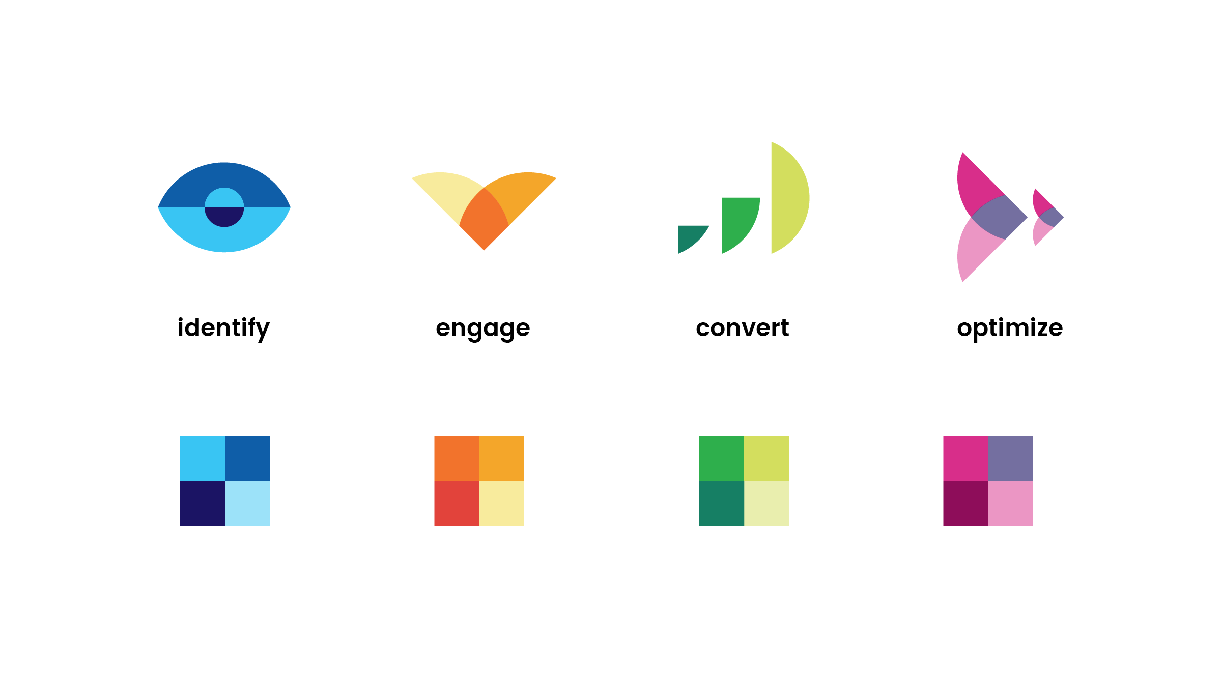
The logo utilized the half circle of the Pepsico mark in their brand blue. To play off of this, I was hired to create icons and help with some brand elements that could strengthen the brand. I thought it could be an interesting concept if each icon was created out of these half circle shapes and then morphed into different colored forms. An eye for Identity, two shapes crossing for Engage, an abstract bar graph for convert, and an arrow shape becoming smaller / more streamlined for Optimize.


Color
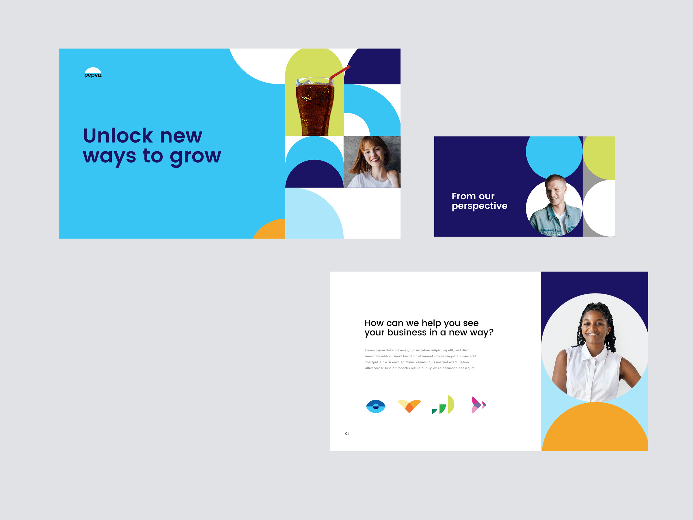
The Pepviz brand was meant to feel very bright and playful. I chose bright colors that complimented the brand blue to be used through out the icons, while for the pattern system used, I focused on the brand blue, darker blue for contrast, and lime green to represent growth. This pattern was used through out google slides, white papers, and webdesign of Pepviz.
Web Design
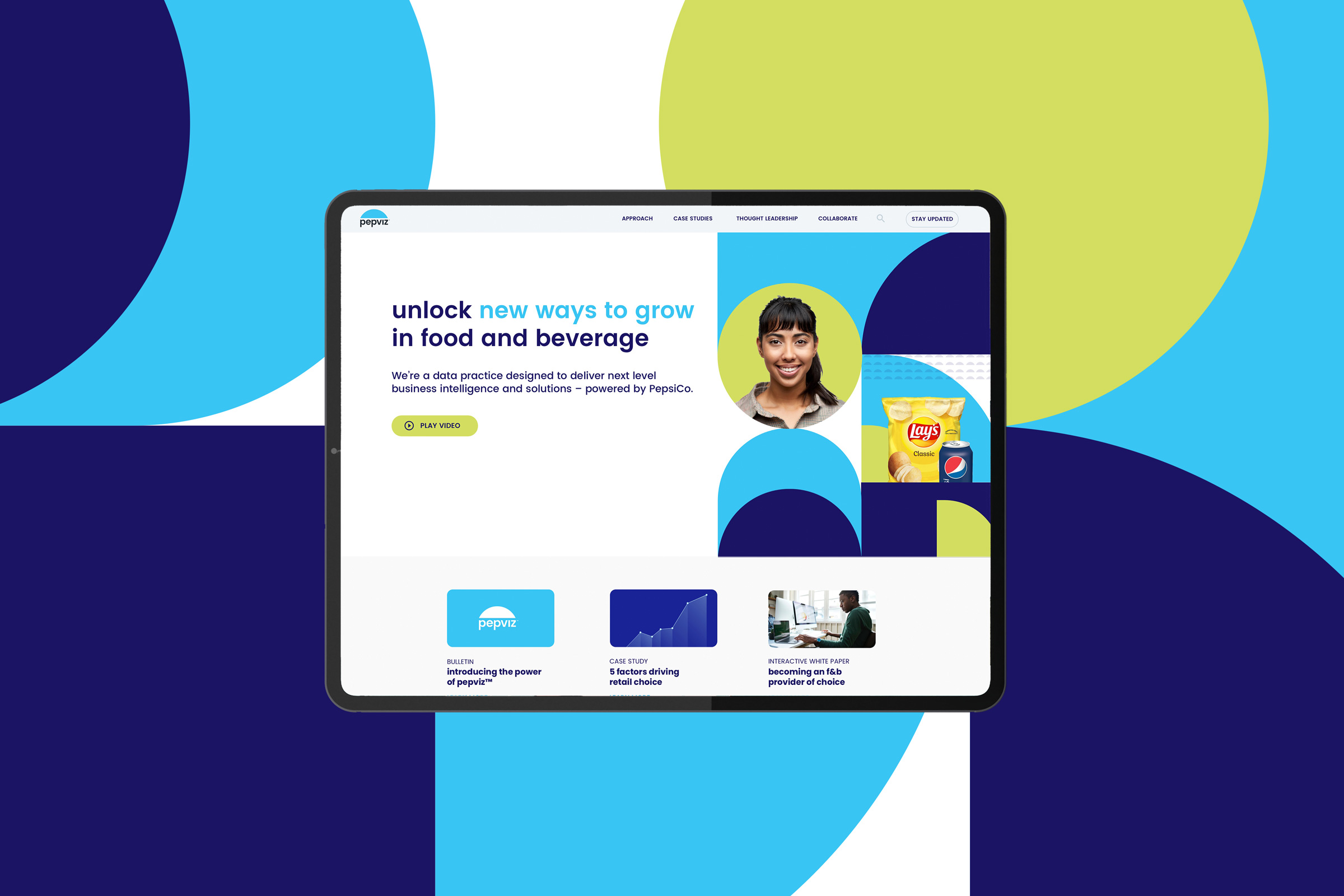
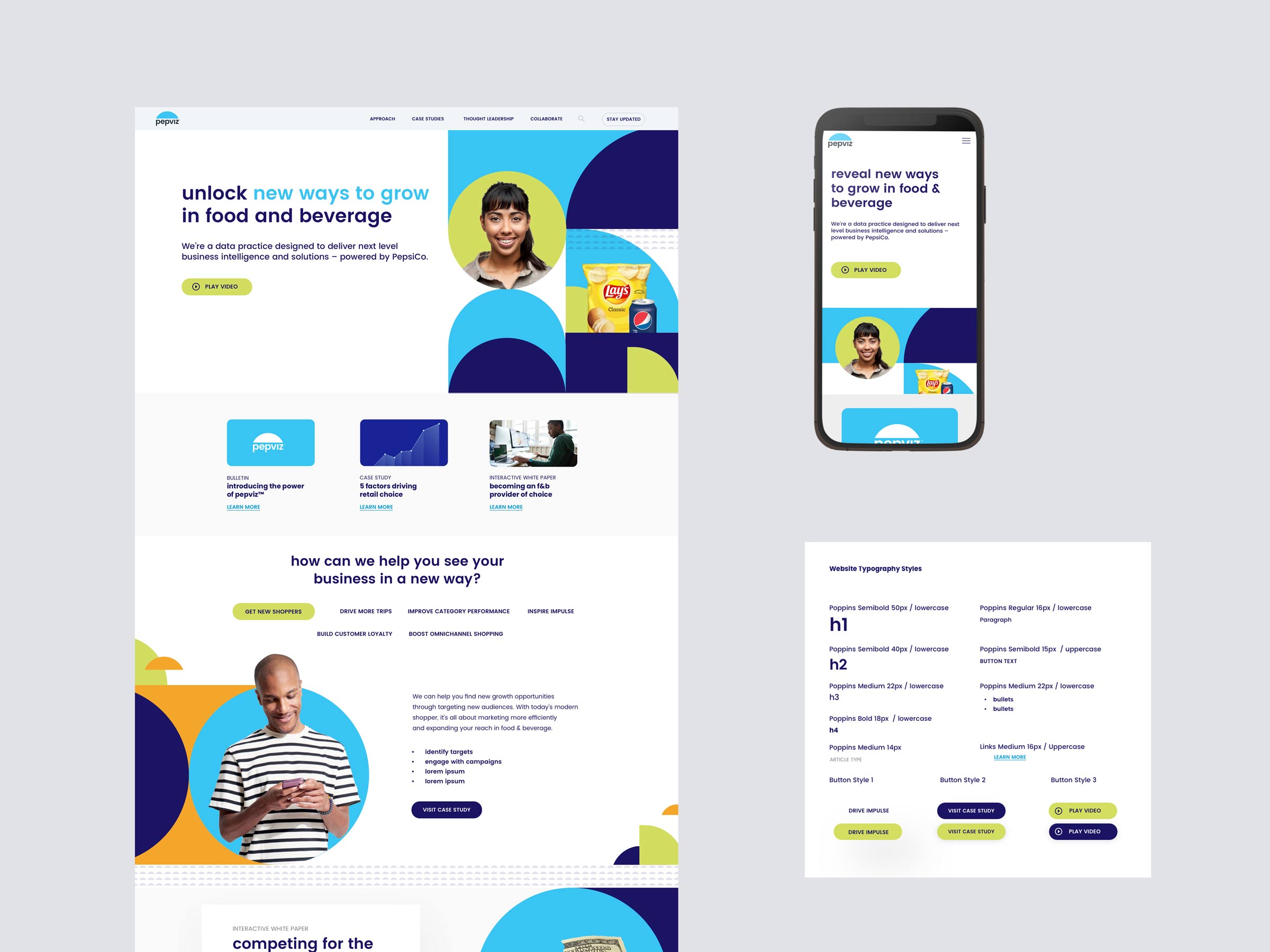
The landing page is an example of how all these brand elements live in harmony. The client wanted to focus on people and their products as well as these bright patterns used so some of the shapes were used as “windows” for people to live in. A smaller pattern of the half circle was used in mixture with the pattern to show the flow of data from one place to another and to add dividers to sections of the site.
It’s not every day I get to work on a project as big as Pepsico, and working with the Shoptology team was great. I’m very proud of what we were able to accomplish in a few short weeks and proud to have it in my portfolio.

If you’re looking for some personal branding or another design project, feel to contact me below. I’d love to go over your ideas!
Kevin Craft | Freelance Branding Designer

