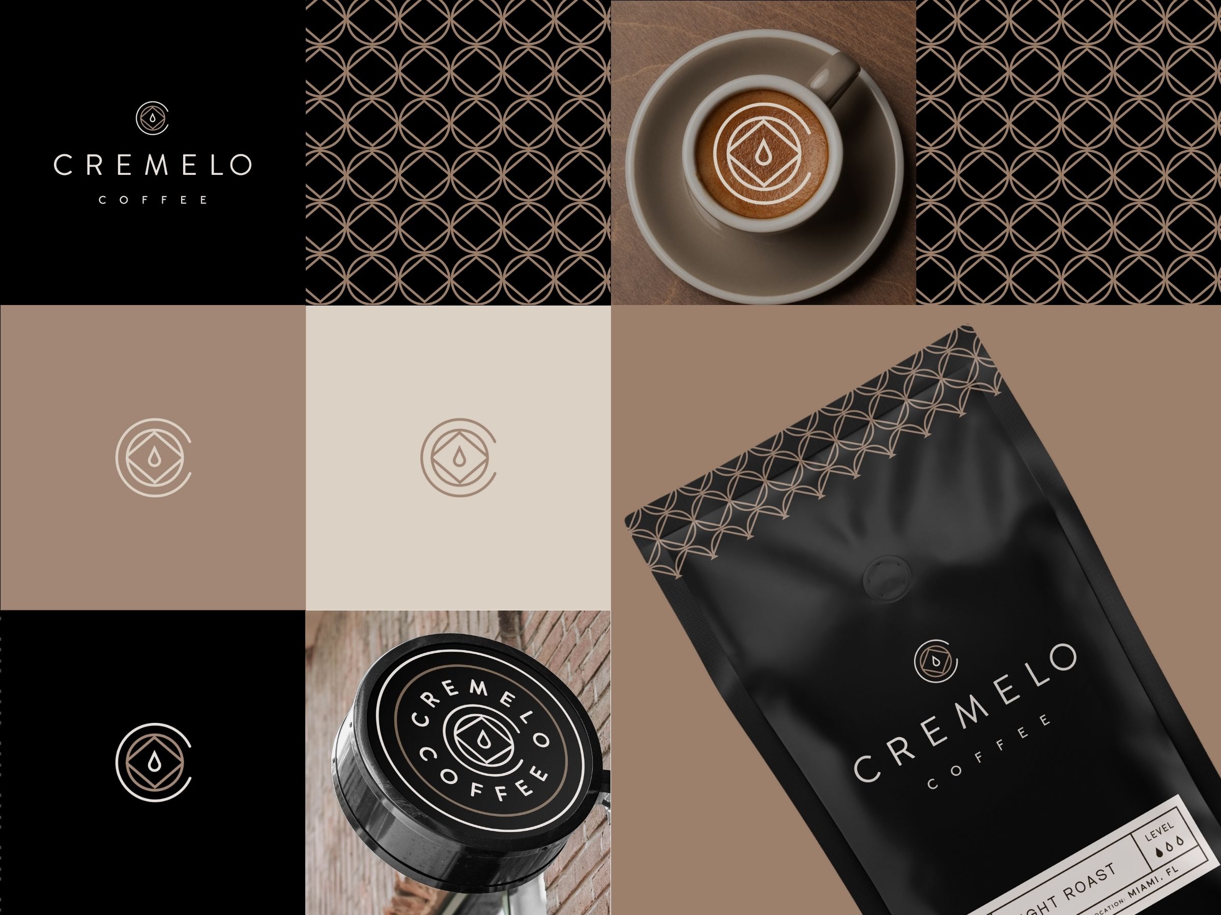
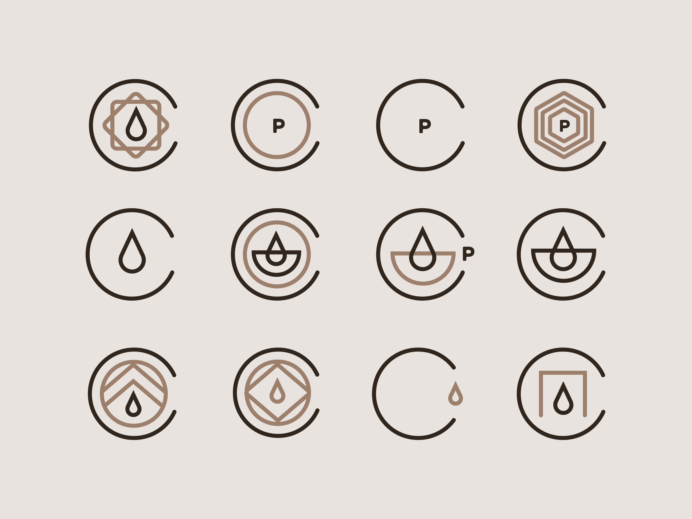
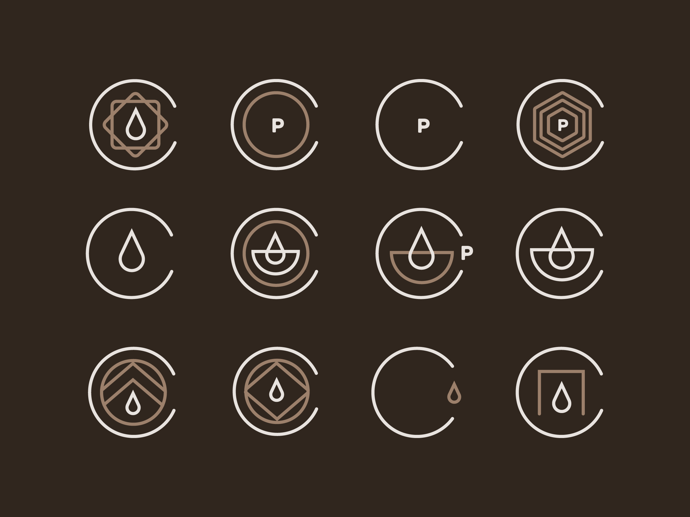
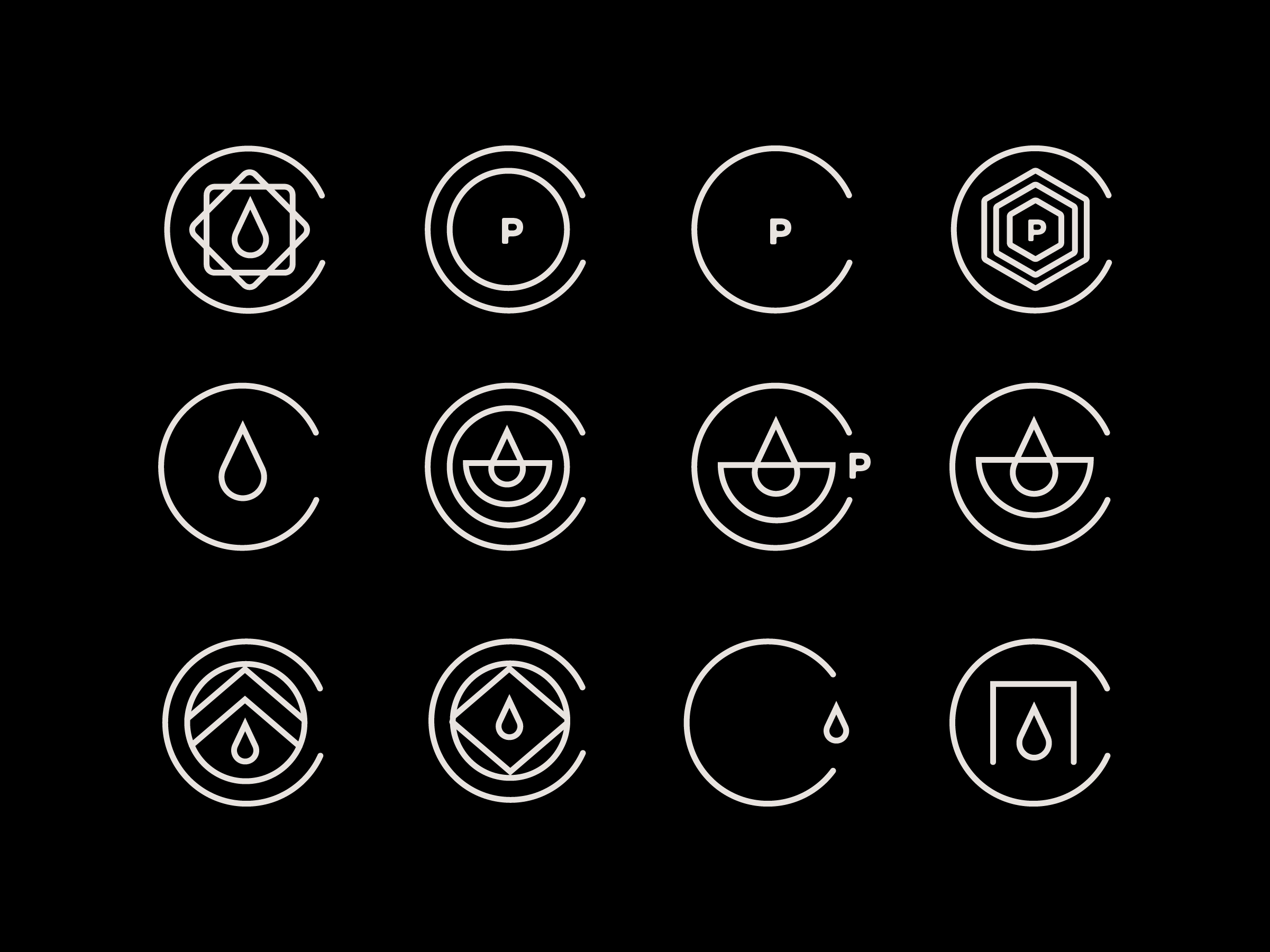

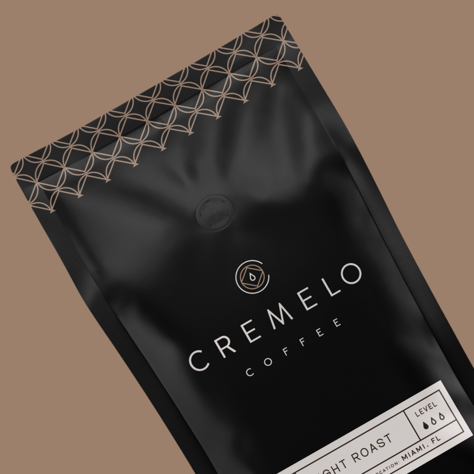
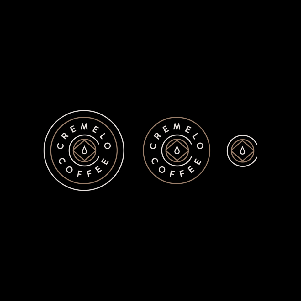
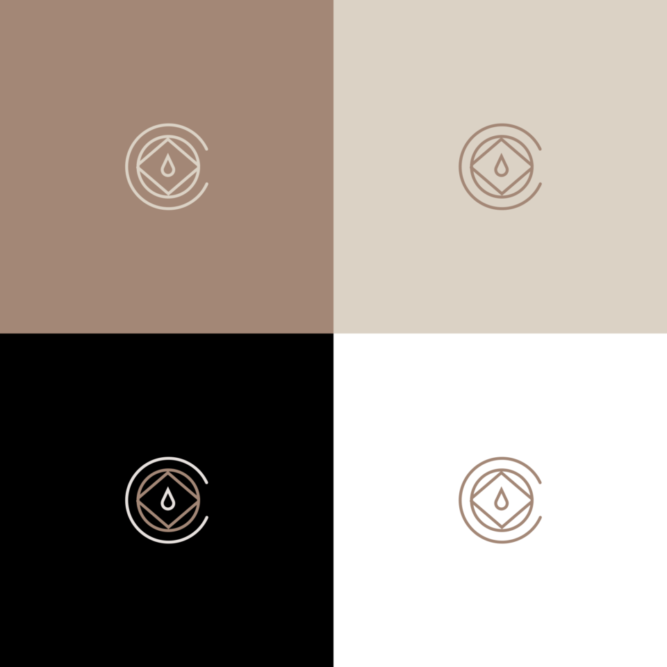
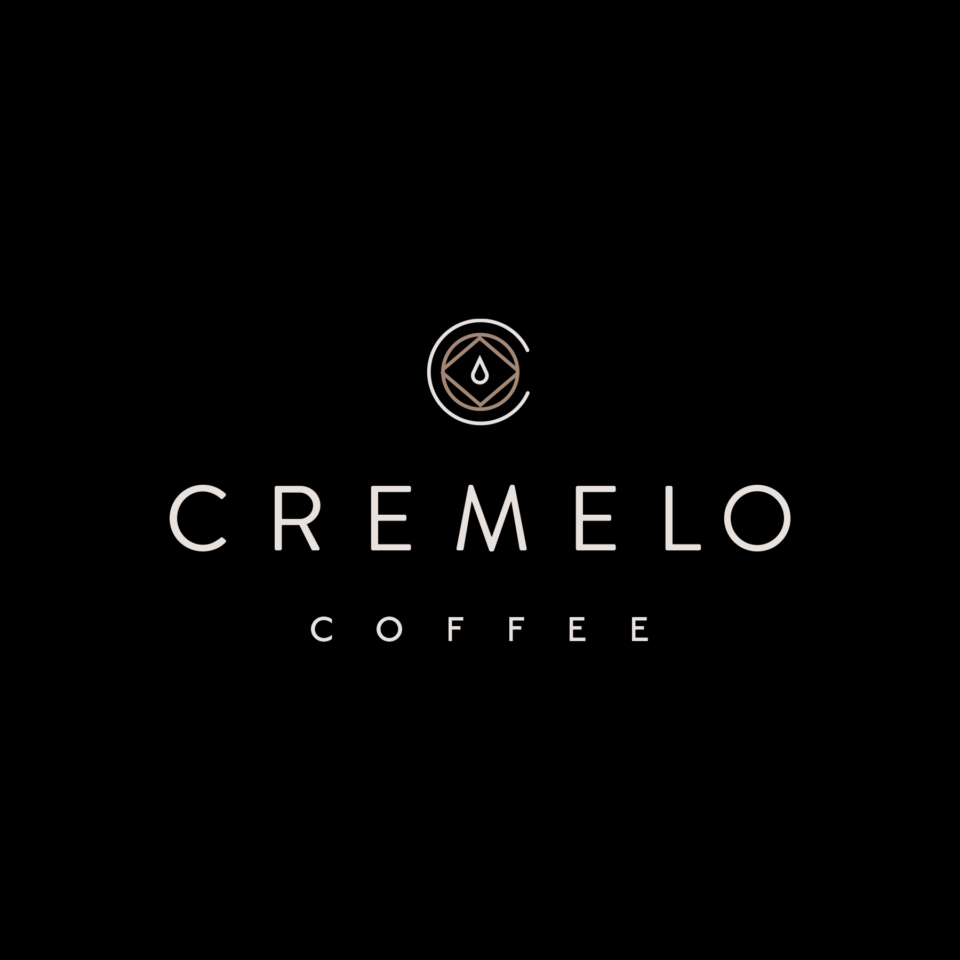
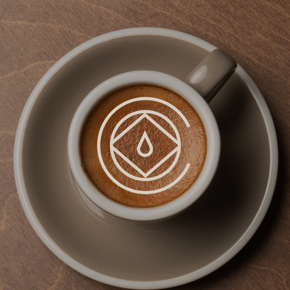
This was an unused monogram concept for a coffee shop I worked on last month. The coffee shop exists within a crate so I wanted to show how the modular geometric shapes within the C of each mark, also showcasing the drip of the coffee. I wanted to show just how many marks happen when I create a new logo. A LOT! I came with a lot of them before I ultimately went with the circle diamond inside of the C. The concept of the coffee shop (changed the name for this) was a space that was created out of shipping crates. I knew there should be some geometric element that enclosed the coffee drip. I also love logos that are modular and can be taken apart to make different sized logos for different purposes.
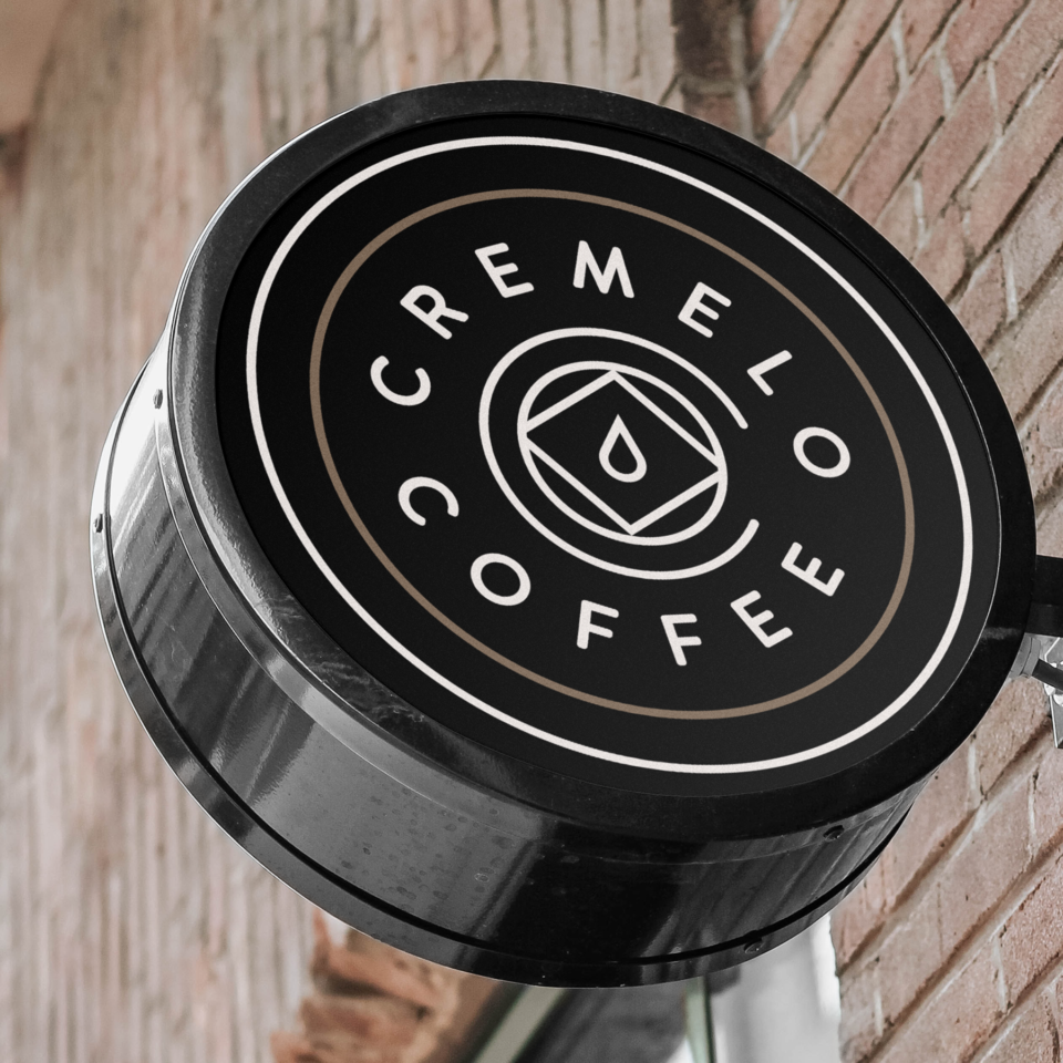
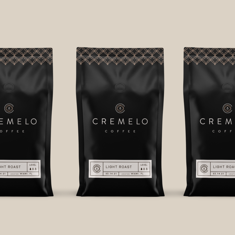
Another thing. Don’t sleep on Canva or new tech in general! I’ve been using it to create some new layouts for Dribbble and it makes it so fast and easy. This one took me no time at all for my Cremelo Coffee project. It’s great for social content. I’ve also gotten in the habit of downloading new creative mockups from Envato to help make my brand identities come to life.

If you’re looking for some branding for a coffeeshop or roaster, feel to contact me below. I’d love to go over your ideas!
Kevin Craft | Freelance Branding Designer

