Team Bedgood Realty
Brand Identity / Logo Design
Author
Kevin Craft Brand Designer
Services
Art Direction / Brand Strategy / Brand Identity / Atlanta Realty Branding Design
BACKGROUND
William Bedgood runs a successful realty group in Atlanta, Georgia. He was in need of a refresh and contracted me for a new aesthetic. I worked with him to come up with the branding of his company using both design and strategy.
Below I’ll go through my full process on how I came up with his brand identity.
BRAND STRATEGY
Before I begin work on a design I start with a few brand strategy exercises that help unlock important characteristics of the company. This helps us both understand who we are trying to attract, and what is the perception of the aesthetic to that target.
KEY TERMS
This is an exercise I do to discover brand characteristics of the client. I worked with William to come up with 15 brand key words, then narrowed it down to five that my designs would cohesively represent in the finished design.

IDEAL NICHE
This is a tool that I use with my clients to better help to determine who they are marketing to. I’ve found that breaking down their ideal customer into a niche helps set important characteristics of what the brand will ultimately look like.

WHAT WE LEARNED
In addition to the brand characteristics of trustworthy, tailored, creative, knowledgable, and relationship focused, the brand must reflect a premium aesthetic that appeals to both young and older home owners in Atlanta.
Mood Board
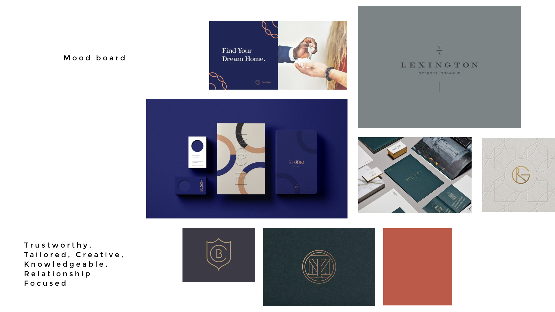
After I go over the brand workshops with clients I start out by showing them a mood board. This is a curated collection of images and designs I’ve found that represents the keywords and information we’ve identified. This insures that we are both on the same page in terms of overall aesthetic, and there’s no big surprises when I get into the brand identity options.
Mood Board
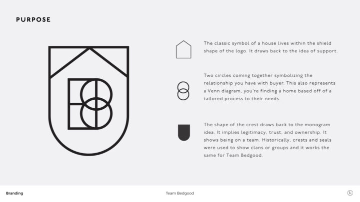
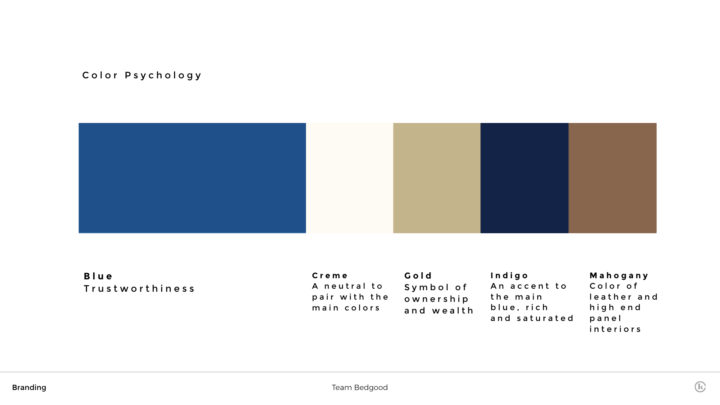
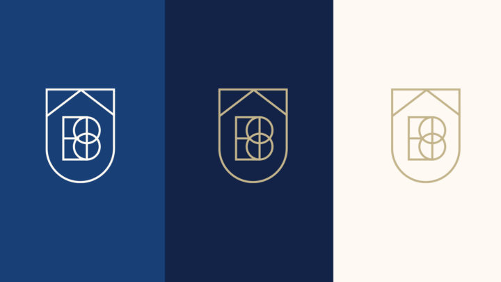
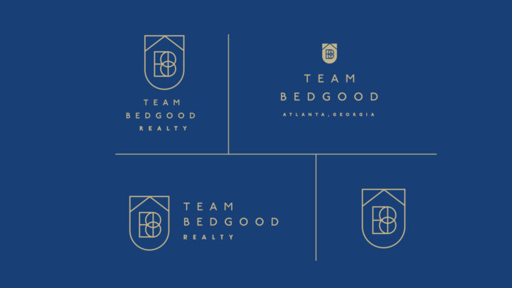
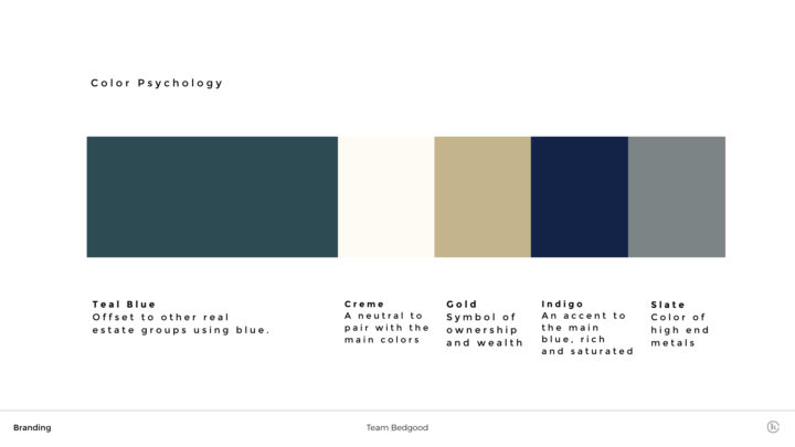
I broke down the first option of the logo by it’s purpose, color psychology, orientation, small scale examples, and large scale examples. I wanted William to be able to see how the logo would live before he made his decision.
PURPOSE
- The classic symbol of a house lives within the shield shape of the logo. It draws back to the idea of support.
- Two circles coming together symbolizing the relationship you have with buyer. This also represents a Venn diagram, you’re finding a home based off of a tailored process to their needs.
- The shape of the crest draws back to the monogram idea. It implies legitimacy, trust, and ownership. It shows being on a team. Historically, crests and seals were used to show clans or groups and it works the same for Team Bedgood.
- The logo has a classic look that draws back to historic architecture, but fused with a modern sans serif typeface to appeal to younger audiences.
OPTION 2
PURPOSE
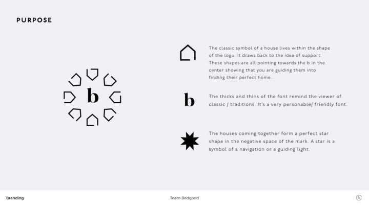
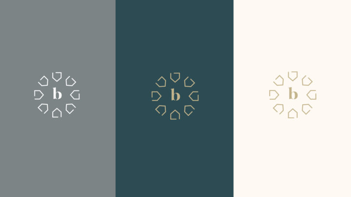
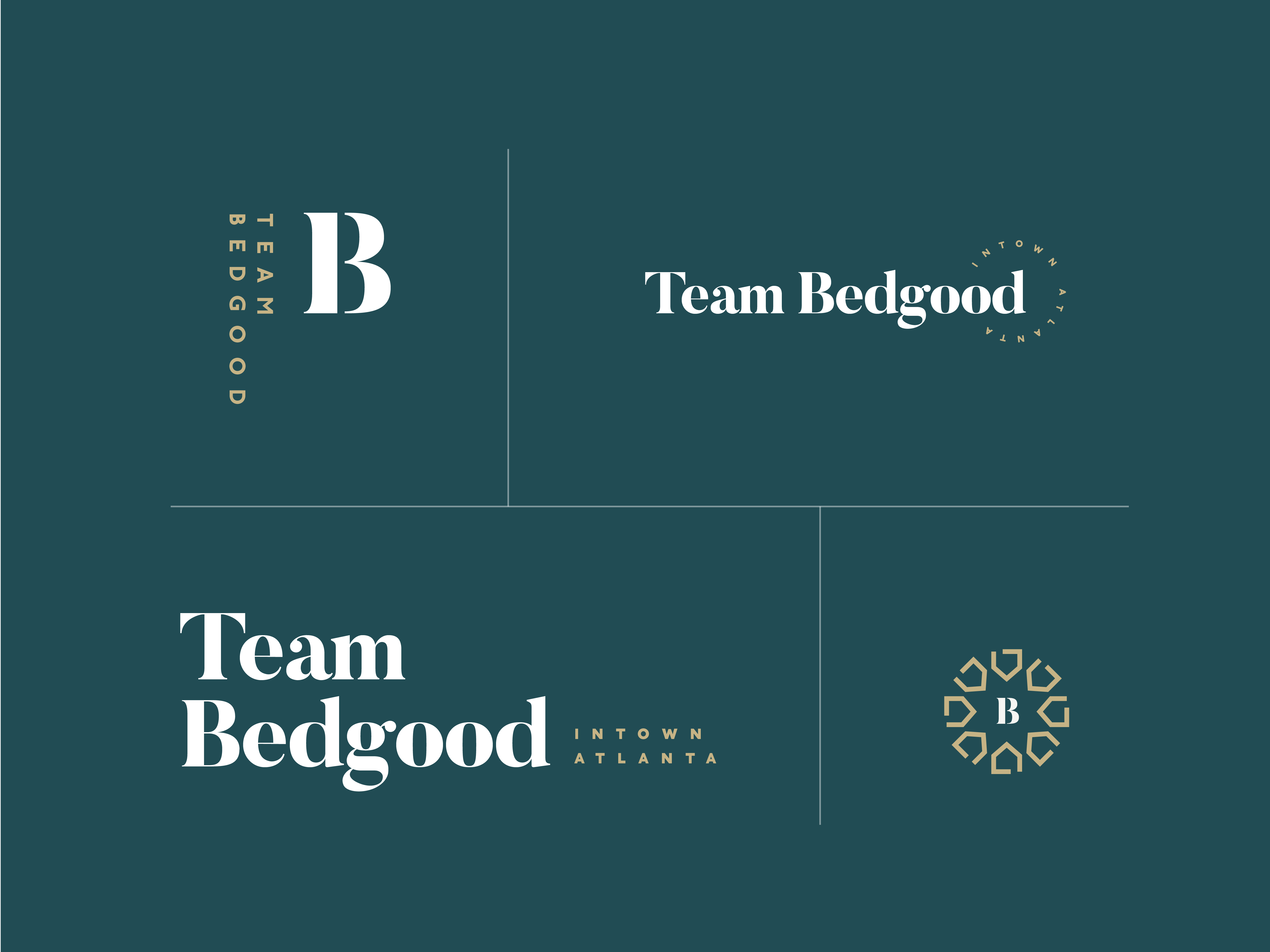
- House shape. The classic symbol of a house lives within the shape of the logo. It draws back to the idea of support. These shapes are all pointing towards the b in the center showing that you are guiding them into finding their perfect home.
- The B in the center. The thicks and thins of the font remind the viewer of classic / traditions. It’s a very personable/ friendly font.
- The logo has a classic look that draws back to historic architecture, but fused with a modern sans serif typeface to appeal to younger audiences.
- The houses coming together form a perfect star shape in the negative space of the mark. A star is a symbol of a navigation or a guiding light.
REVISIONS
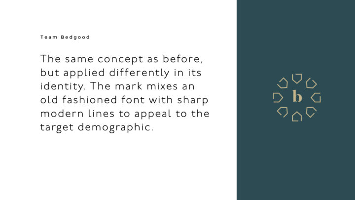
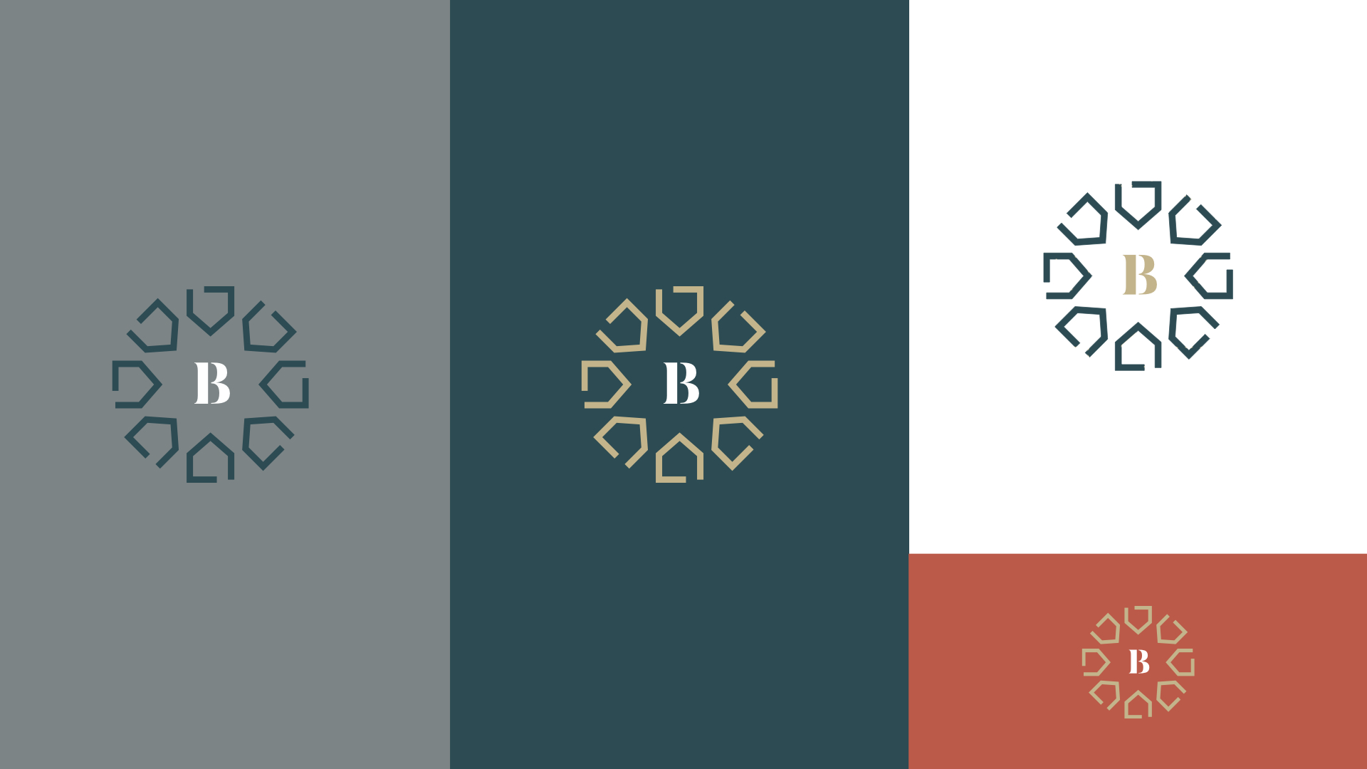
William went with the second option. He liked that the color scheme was more teal than blue which is commonly used in real estate, and would stand out amongst competitors. He liked the mark, but wondered if the brand was looking too old fashioned and could use some brighter colors. He also wasn’t sure about the negative space creating the star shape, or the lowercase letter b.
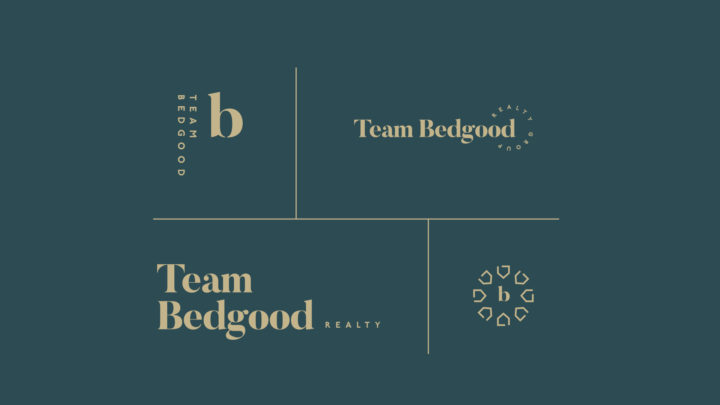
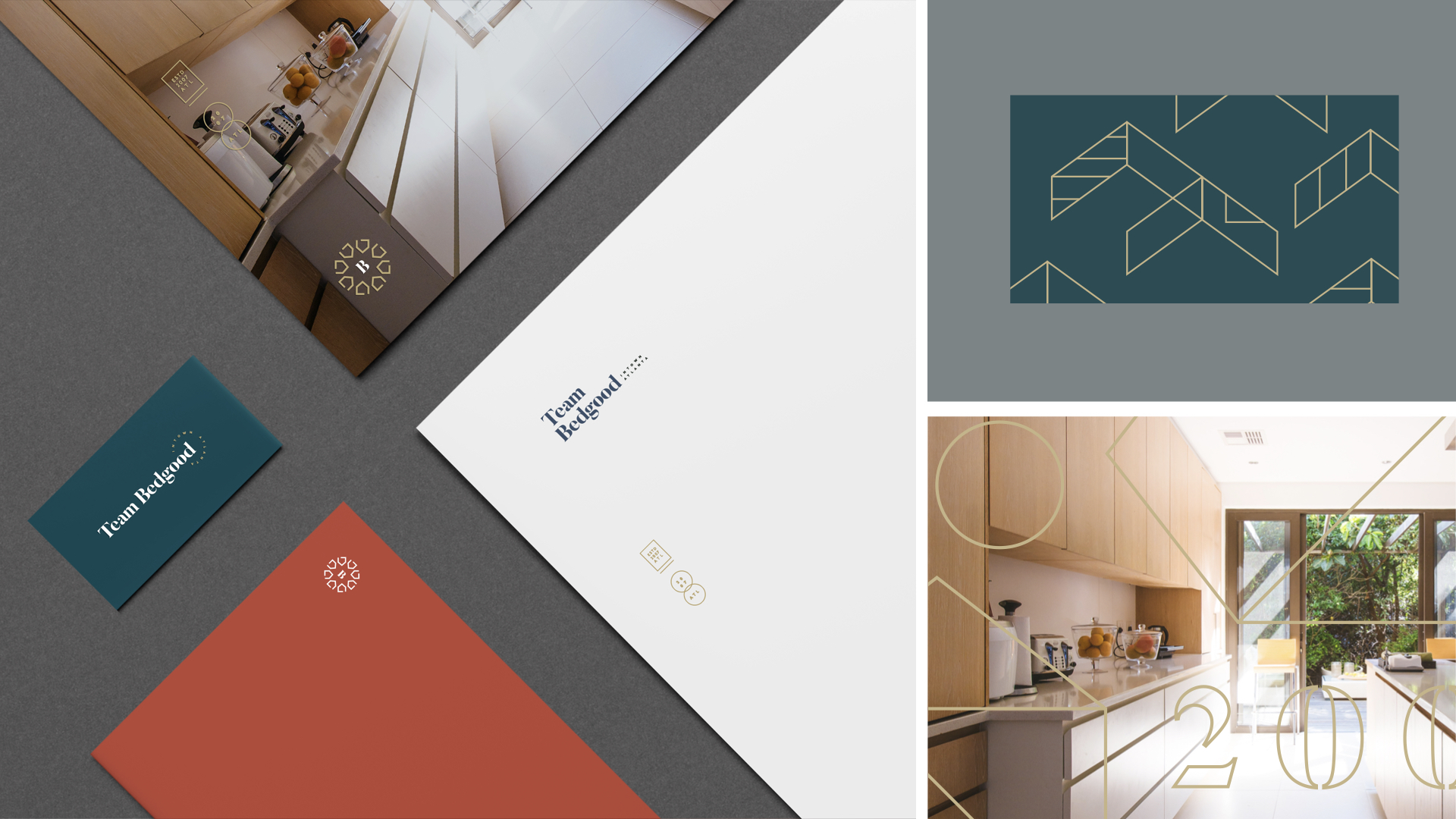
I started by moving the house shapes inward in the logo. I’m happy I did because I love the shape that it made. The star is very prominent. I added a bright white, and warm red to the color scheme to give it some balance and also stand out a little better.
PATTERNS
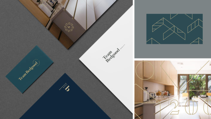
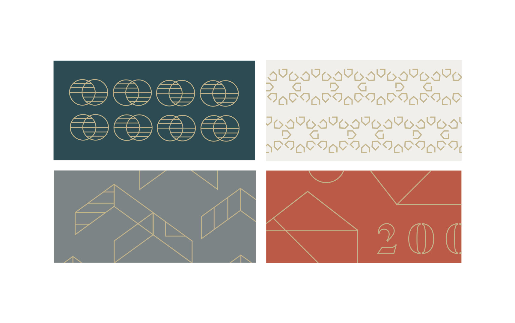
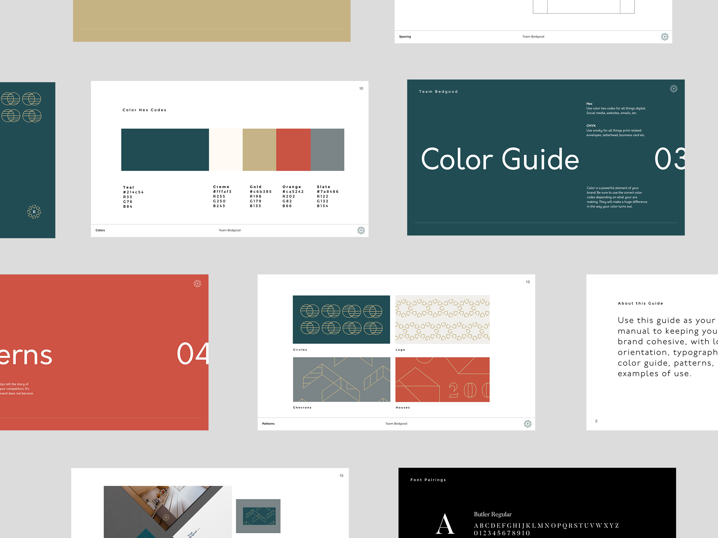
Next were patterns. I created several for his brand in all different color schemes so he’d have a lot to get started with. It’s always good to have 2-3 in your back pocket to keep the brand interesting. Some were created out of parts of the logo, some are historic representations of architectural forms in Atlanta.
FINALE
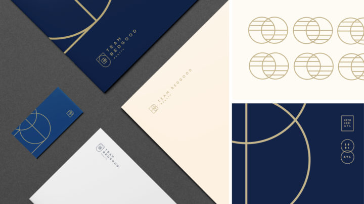
And finally, the most important step of working with clients is handing them the brand itself. With so many files types, and so many assets this can be daunting for them, especially if not coming from a design background, which many are not. What I always provide in my designs is a short brand guide that gives them the blueprints in setting up their brand. It includes a guide for logo usage, color palettes, typography, and patterns.
TESTIMONIAL
“Kevin asked thoughtful, insightful questions about my business in order to help him really understand what designs would be best suited for my purposes. He was the consummate professional in every aspect. I could not have asked for a better experience. I highly suggest Kevin Craft & his Company. “
William Bedgood, Owner

