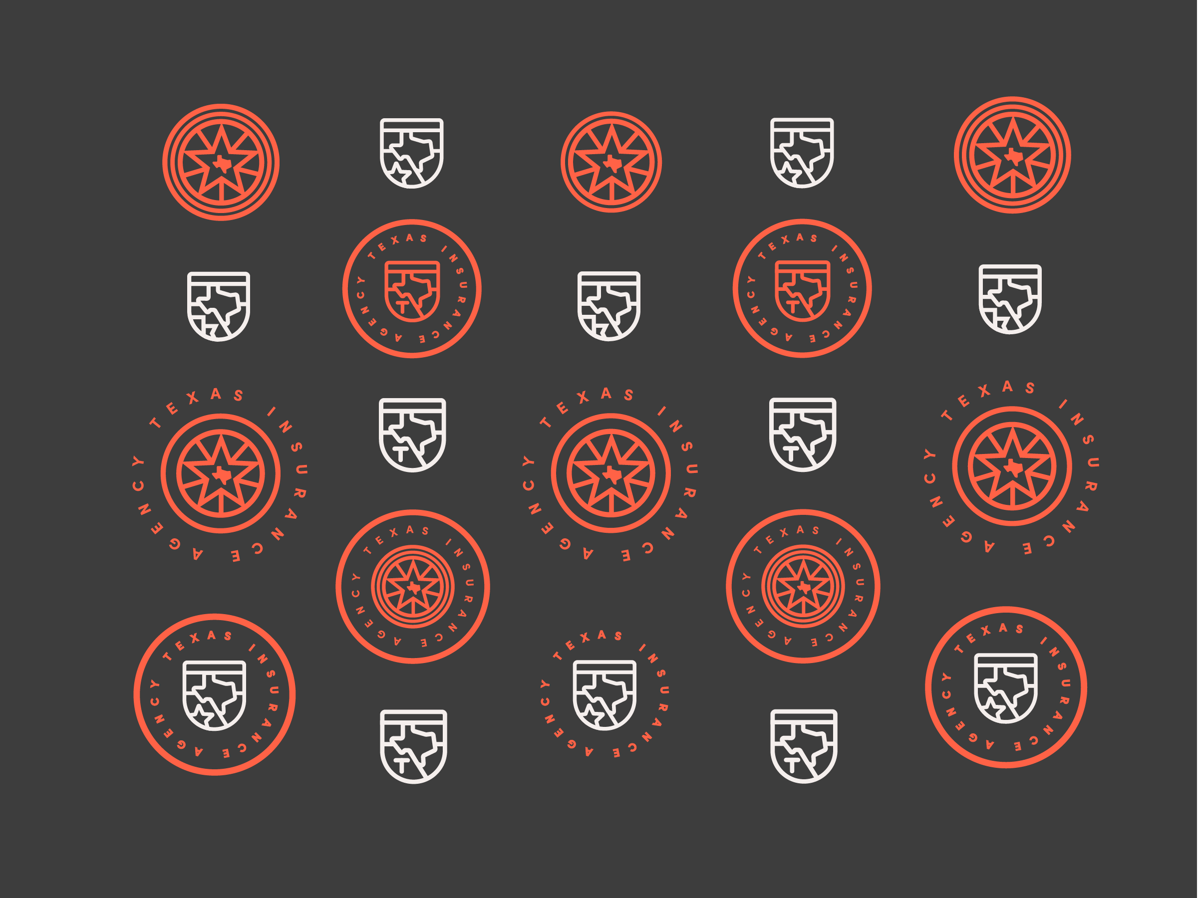
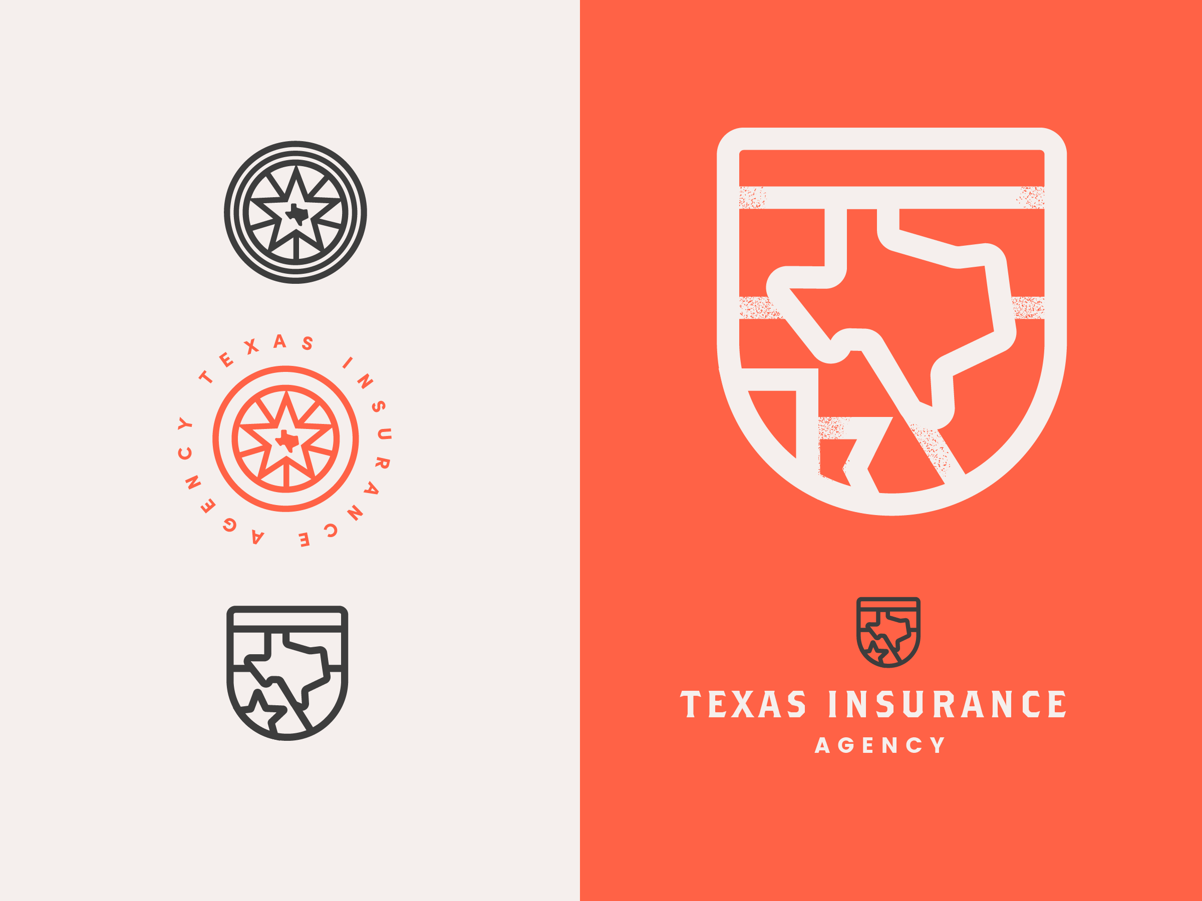
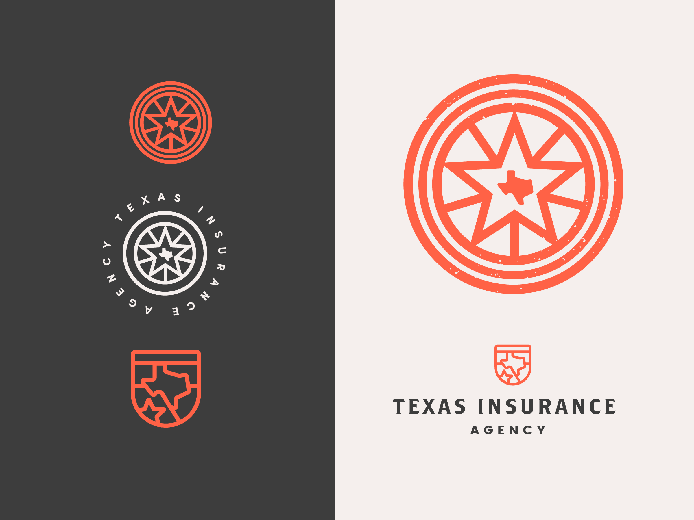
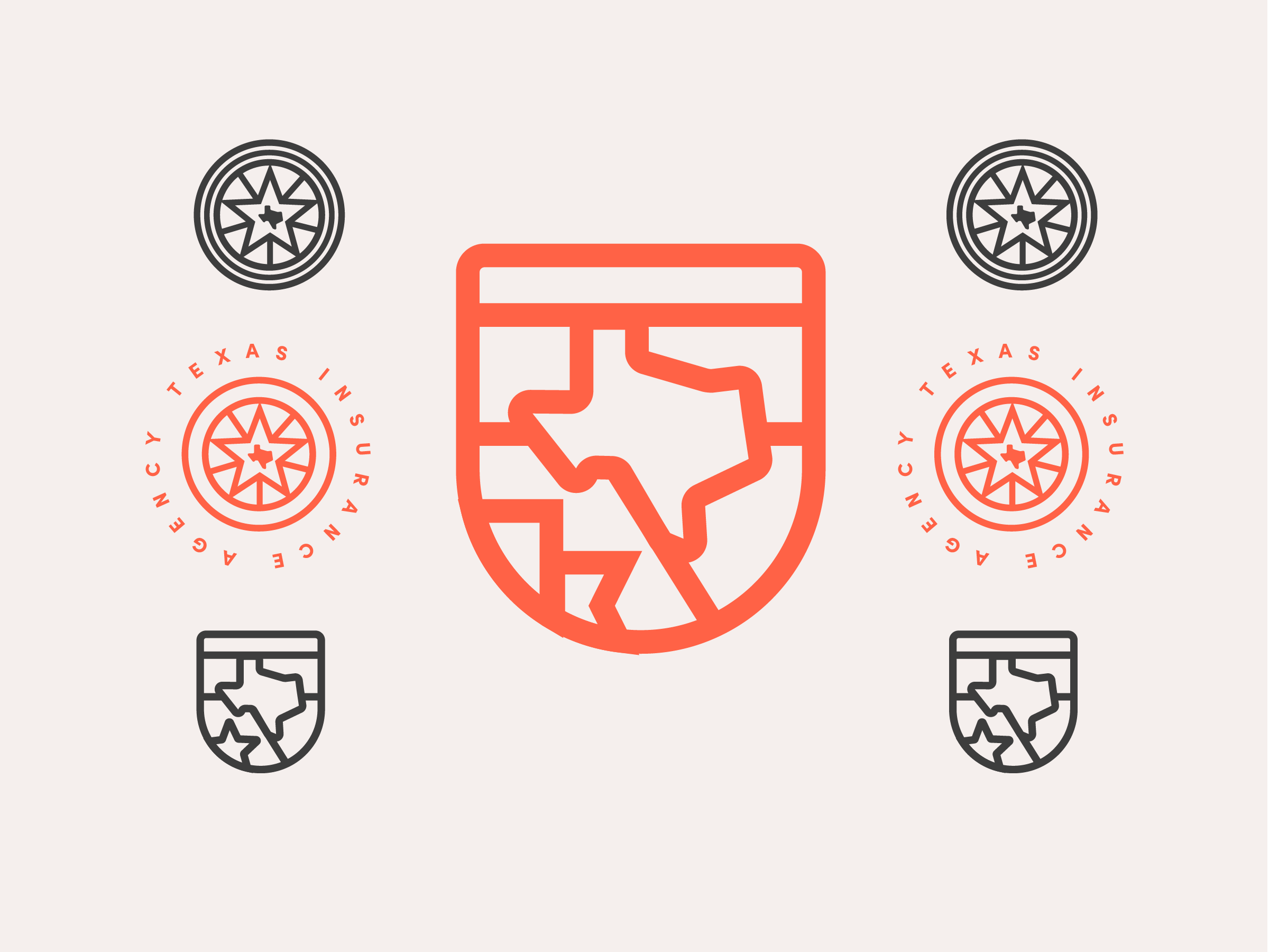
Here are some marks I created for a Texas based insurance company in DFW. I wanted to make their target feel safe by using a shield, or seal-like imagery to establish legitimacy / have them feel like they were in reputable hands. Let’s face it, insurance can be boring! I mixed that with this bright, orange red and earthy black to stand out against their competitors. Ultimately, this was too much of an edge for the client and they went with something much more conservative, but I really love these two marks and wanted to show them off. 🙂

