Boostcamp
Brand Identity
Creative Directors: Kevin Craft
Services
Art Direction
Brand Identity
Case Study: Boostcamp Fit Tech App
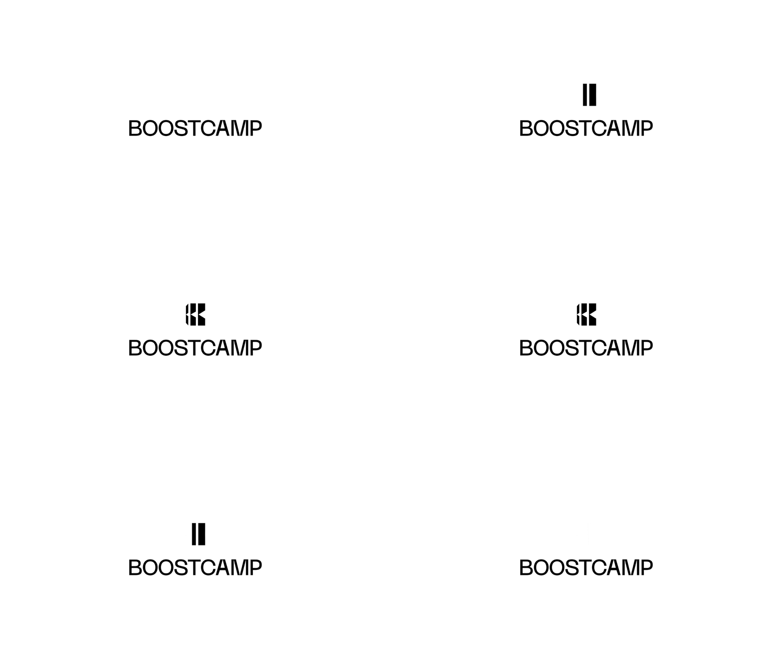
The brand identity for Boostcamp centers on growth, strength, and progress, encapsulated in the bold design of its logo—a dynamic “b” that symbolizes building and becoming stronger over time. This mark, paired with a clean and contemporary sans-serif wordmark, reflects the app’s mission to empower users to achieve their fitness goals through resilience and determination. The identity’s minimalist approach ensures it remains timeless, emphasizing functionality and focus, key attributes of a tech-driven fitness brand.
The color palette, rooted in black, white, and gold yellow, represents a balance of power, clarity, and achievement. Black and white create a clean, strong foundation, while the gold yellow serves as a motivational accent, symbolizing triumph and vitality. This palette ensures that Boostcamp’s visuals convey energy and sophistication, resonating with users who value both performance and aesthetics.
Patterns within the identity emphasize strength and growth through bold, angular shapes and grid-like structures. These designs evoke the idea of building muscle and endurance while also mirroring the precision of fitness tracking data. From digital interfaces to marketing materials, these elements reinforce the brand’s core themes of empowerment, progress, and innovation.


